Pyalgotrading Analytics
-
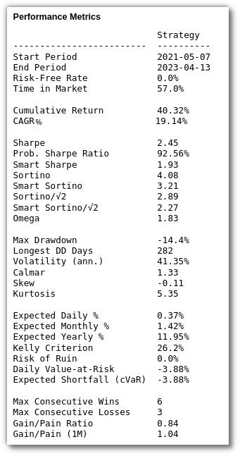
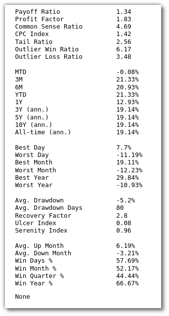
Metric Values and Statistics
-
Cumulative Returns
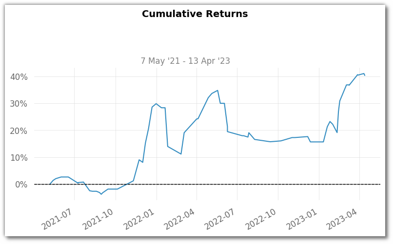
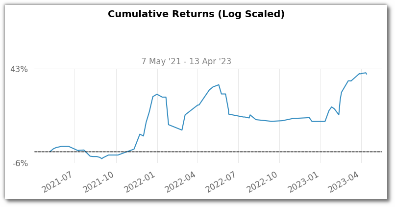
- The Cumulative Returns chart illustrates how our strategy's returns value has evolved over time in percentage.
- Positive values indicate gains, while negatives reflect losses. Bigger positive returns are more favourable.
- Keep in mind, this chart focuses on gains and losses, excluding risk and timing considerations.
- There are 2 sub categories of cumulative returns chart depending on the scale we are using. One is normal scaled and other is log scaled
-
End of Year Returns (EoY)
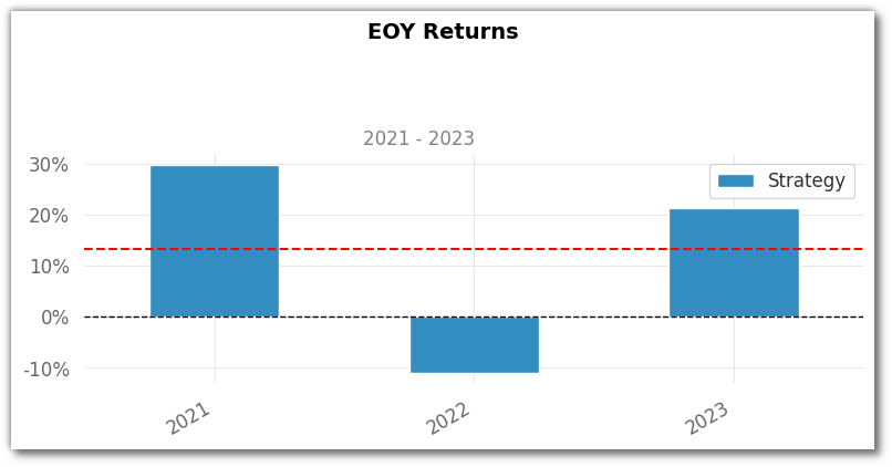
- The End of Year Returns chart showcases our strategy's annual performance as a percentage.
- It quantifies its overall performance, considering gains or losses throughout each year.
-
Distributions of Monthly Returns (Histogram)
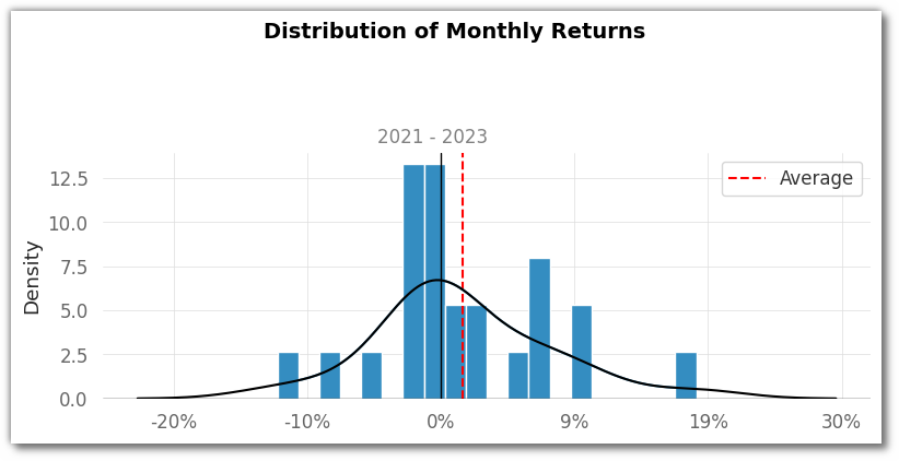
- In the Monthly Returns Distribution Histogram, we see the frequency distribution of different levels of returns over consecutive months.
- This histogram helps us understand the range and patterns in monthly returns, shedding light on our strategy's volatility and performance trends.
-
Daily Returns
- The Daily Returns Chart portrays the percentage change in our strategy's returns between trading days.
- It provides insights into short-term volatility, trend analysis, and risk assessment.

-
Rolling Volatility (6 months)
- A Rolling Volatility (6 months) Plot showcases the changing volatility of an investment over time using a rolling window of six months.
- This plot reveals how the investment's price fluctuations vary as the window moves across the dataset.
- It provides insights into short-term volatility patterns, helping investors understand how the investment's risk level evolves in response to different market conditions.

-
Rolling Sharpe (6 months)
- A Rolling Sharpe (6 months) Plot illustrates the dynamic changes in the Sharpe ratio over time using a rolling window of six months.
- The plot shows how the risk-adjusted performance of an investment fluctuates as the window moves through the dataset.
- This visualization helps investors understand how the Sharpe ratio varies with changing market conditions and provides insights into the investment's consistency and risk-return trade-offs over short-term periods.

-
Rolling Sortino (6 months)
- A Rolling Sortino (6 months) Plot visualizes the variation in the Sortino ratio over time using a rolling window of six months.
- This plot demonstrates how the investment's risk-adjusted performance, considering only downside volatility, changes as the window progresses through the data.
- It offers insights into how the Sortino ratio evolves with market conditions, helping investors assess the investment's ability to generate favorable risk-adjusted returns over short-term intervals.

-
Worst 5 Drawdown Periods
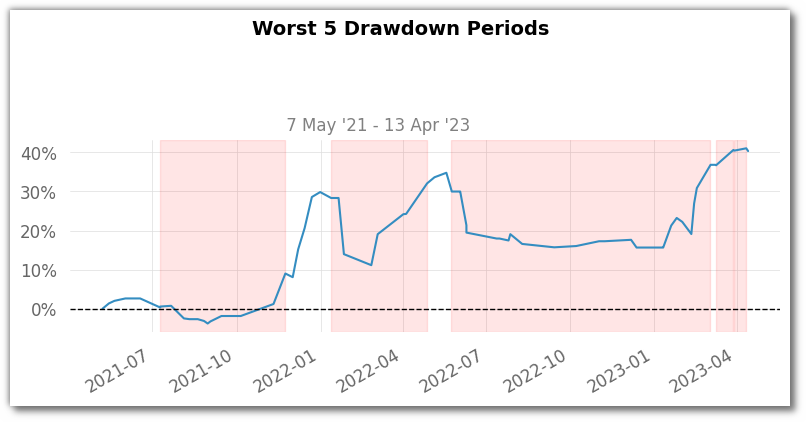
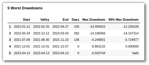
- A Worst 5 Drawdown Periods plot displays the top five periods during which the strategy experienced the largest declines from peak to trough.
- This visualization helps strategists understand the most significant loss-making episodes in the strategy's run.
- It shows the magnitude and duration of these drawdowns, providing insights into the strategy's risk and potential vulnerabilities.
-
Underwater Plot
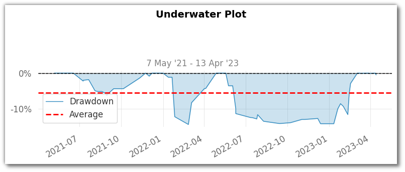
- The Underwater Plot visually narrates our strategy's performance concerning its past peaks.
- It showcases how much our returns value has dropped from its highest point over time.
- This aids in visualising periods of drawdown and recovery, offering insights into historical risk and resilience.
-
Monthly Returns (Heatmap)
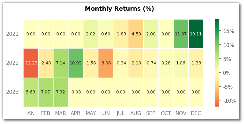
- The Monthly Returns Heatmap offers a colour-coded view of our strategy's performance across months.
- Shades of green indicate positive returns, while shades of red signify losses.
- This visual tool helps spot trends and patterns, aiding in identifying strong and weak performance periods.
Last update:
2024-08-03